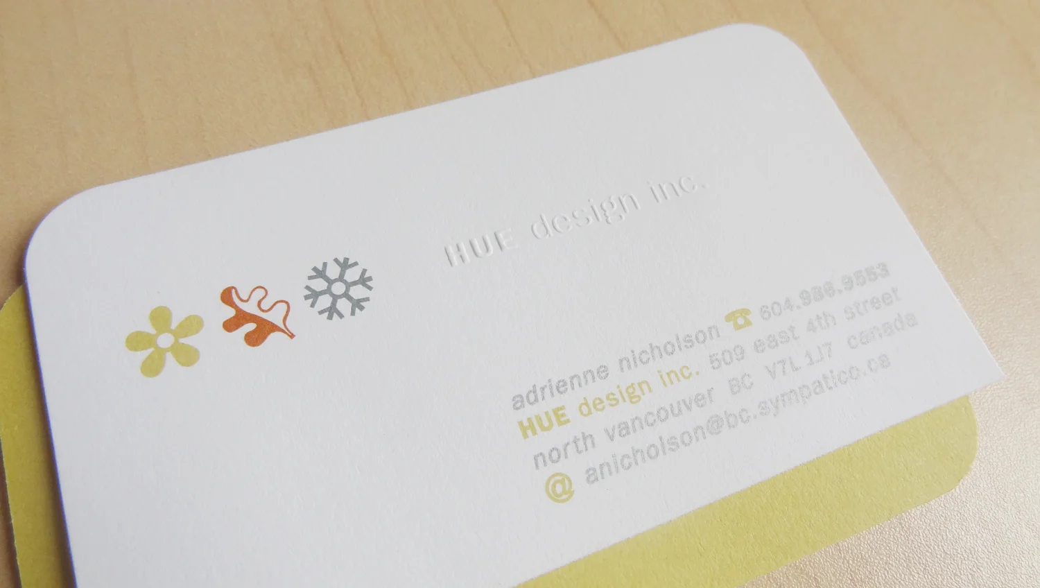
The name HUE was chosen for its simplicity. Colour and hue affects our emotions and impulses and therefore can be key to the success of a design project or product. I utilized multicolours, icons and textures to create a band that mimics that seen on the edges of offset printing proofs.
With my first business card I wanted to showcase my love for colour and the feel of paper and what offset printing has to offer. It was a great teaching tool, as I was able to show a client what a card could offer through die-cutting, multicolour printing, embossing and the careful choice of stock weight and texture.
I also love to collect old packaging and nastalgia, particularly for their fonts. In the launch year, HUE sent out postcards each season to remind friends and design contacts that HUE Design Inc. was open for business. Two of the postcards sent out in the first year, were fun collages inspired by my collections.


